When you search for the same query on mobile vs. desktop, have you ever noticed differences in rankings? Mobile vs. desktop rankings may show similar results, but search engines tailor them differently to enhance user experience on each device.
Search engines like Google prioritize mobile-friendly results for smartphone users while displaying more detailed information for desktop searches. From URL structure, meta descriptions, and local SEO emphasis to content formatting and click-through rates, key factors influence how rankings differ between platforms.
In this guide, we’ll break down the key differences between mobile and desktop rankings, why they matter for SEO, and how you can optimize your website for both.
Here’s a snapshot of what we covered.
| Mobile | Desktop | |
| Search elements |
|
|
| Click-through rate | Low | High |
| Operating system | Considered for search results | Not considered for search results |
| User experience and design | Affects mobile experience | Affects desktop experience to a lesser degree |
| Load time | High impact on ranking | Medium impact on ranking |
| Local SEO | High focus on local intent | Less focus on local intent |
| Keyword usage | Conversational | Short and specific |
| Content structure | More quick answers and solutions | More in-depth content |
1. Elements Shown in the Search Results Page
Mobile
Firstly, local search results on mobile devices start with the local map pack and business information, pushing the regular search results downward. This is why local SEO conversion is higher on mobile devices than on desktop devices. Users tend to click on businesses ranking on the map pack first.
Also, regular rankings have short titles to fit the smaller screen width, and their URLs are often simplified, showing just the domain or a breadcrumb-style format. Meta descriptions on mobile search results are shorter to fit the screen, and rich snippets display more compactly with essential information prioritized.
Google’s quick answer feature, i.e., the People Also Ask segment and related searches, displays vertically, requiring users to scroll.
Desktop
Let’s start with the local SEO result on desktop devices. Local business information is displayed at the top of the search result, while the Local map pack appears to the right.
Knowledge panels also appear on the right side of search results, providing a broad overview of the topic.
For search results with ads, there is more space for a clearer distinction between ads and organic results.
When we move down the search results, we start with the titles of organic search results. The titles of ranking pages are displayed in full with visible characters. More of the URL is visible, though it might still use a breadcrumb format for clarity, while the meta descriptions are generally longer, providing more context from the page.
Desktop devices allow more site links, often in a horizontal format below the main result. People Also Ask questions are displayed horizontally, with more room for text. Related searches are at the bottom of the search result, with more room for more than mobile search results.
Most importantly, users can scroll through search results from top to bottom in less time, increasing the click-through rates of pages ranking below.
2. Click-Through Rates
A recent report shows that the organic CTR of mobile search results is almost 50% less than desktop results.
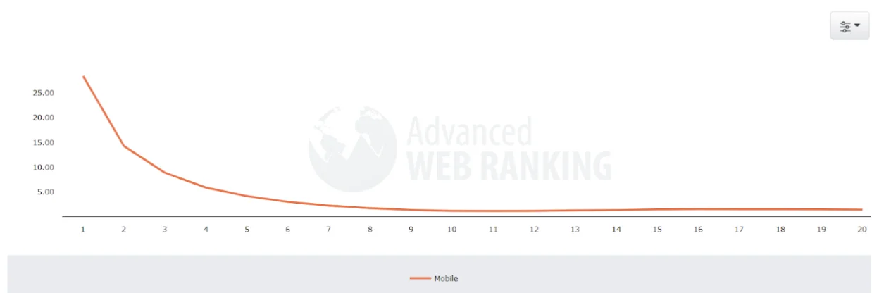
Mobile
As of August 2023, Advanced Web Ranking released a report showing that the #1 position in mobile search has a CTR of 28.36%, the #2 position has 14.22%, the #3 position has 8.84%, while #8, #9, and #10 gets 1.68%, 1.33%, and 1.14% CTR respectively.
Desktop
A recent study shows that the click-through rates of desktop search results changed in 2023. Here is a breakdown of search positions as of September 2023:
| Desktop Search Results | Click-through Rates |
| Ad position 1 | 2.1% |
| Ad position 2 | 1.4% |
| Ad position 3 | 1.3% |
| Ad position 4 | 1.2% |
| Featured Snippet | 8.6% |
| #1 search result | 39.8% |
| #2 search result | 18.7% |
| #3 search result | 10.2% |
| #4 search result | 7.4% |
| #5 search result | 5.1% |
| #6 search result | 4.5% |
| #7 search result | 3.4% |
| #8 search result | 2.6% |
| #9 search result #10 search result | 2.4% 2.2% |
3. The Device’s Operating System
Mobile
Google considers the mobile operating system used to determine the search results with mobile application intent.
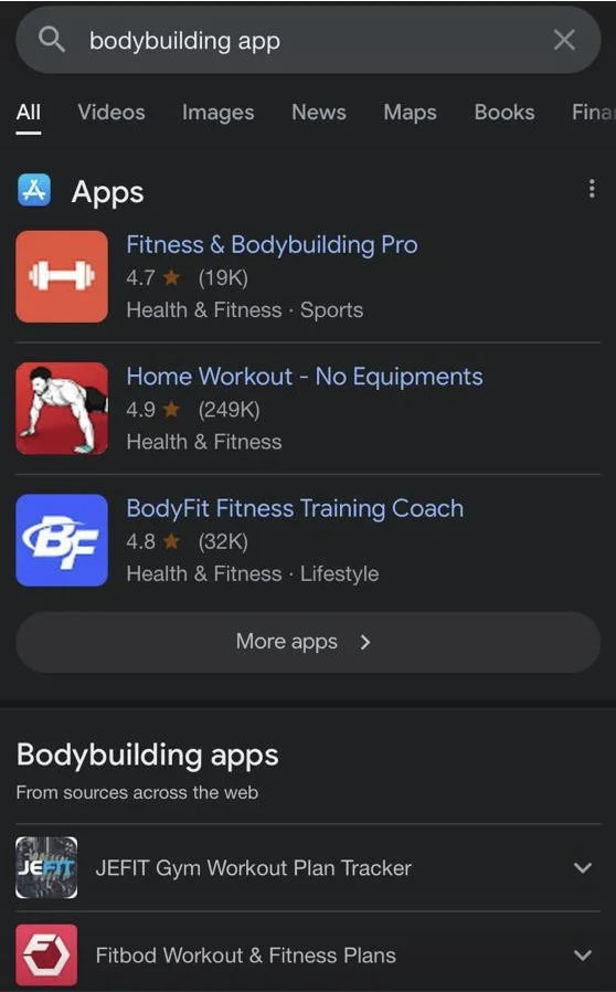
For example, we searched for bodybuilding apps on two smartphones with different operating systems but in the same location.
The first mobile phone was a Tecno Pop 5 pro, an Android device, while the second was an iPhone 11 that uses iOS.
The search results show that search engines provide results compatible with a smartphone operating system for mobile app queries.
It’s expedient you pay more attention to mobile optimization when targeting keywords with mobile app intent.
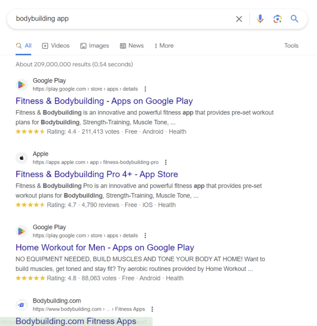
Desktop
We made the exact search on a desktop device. Here was what we saw:
4. User Experience and Design
Mobile
Search engines prioritize websites that offer an optimized and user-friendly experience on smaller screens. Responsiveness, easy navigation, fast loading times, and tap-friendly buttons are crucial for higher mobile rankings.
Desktop
While user experience is also essential for desktop rankings, websites have more flexibility with design elements, given the larger screen size. The focus is on clarity, organization, and the effective use of content features. Sites can afford to have more intricate designs and heavier media without as much impact on load times as on mobile.
5. Load Time
Mobile
Load time is a significant ranking factor for mobile websites. With users often accessing sites on the go, pages must load quickly to retain user attention and rank higher on search engines.
According to a survey of 5,963 sites, anything less than 3.2 seconds of mobile page load time would put you in the best 20% of sites, and less than 2.6 seconds would put you in the best 10%.
Desktop
Although load time is essential for desktop sites, users tend to be more forgiving of slightly slower load times, given the typically more stable and faster internet connections.
The average desktop load time across is 8.6 seconds; however, the ideal load time is less than 3 seconds. A recent analysis shows that reducing page load time from 8 to 2 seconds can increase conversions by 74%. A delay in website load time can result in an 11% drop in page views.
6. Local SEO
Mobile
Mobile searches often have a local intent, with users looking for nearby services or locations. Consequently, local SEO elements like Google My Business, local keywords, and location-based services are more influential in mobile rankings.
Desktop
Desktop searches are often more research-oriented and less focused on local intent. While local SEO is still essential, it may influence rankings less than on mobile.
7. Keyword Usage
Mobile
Mobile users tend to use more conversational or voice search-friendly phrases due to the convenience of voice search features and the inconvenience of typing long queries on small screens. Therefore, optimizing for long-tail, conversational keywords and questions can improve mobile rankings.
Desktop
Desktop users often input shorter, more specific queries, making short-tail and exact-match keywords more effective for desktop SEO.
8. Content Structure
Mobile
Mobile users typically seek quick answers and solutions, making concise, easily scannable content with clear headings, bullet points, and images more compelling.
Additionally, Google’s use of AMP (Accelerated Mobile Pages) influences mobile rankings, rewarding pages that offer streamlined content and faster load times on mobile.
Desktop
Desktop users often spend more time on websites and are willing to engage with longer, in-depth content. As such, long-form content can be more effective for desktop rankings.
Why Do Mobile and Desktop Search Results Differ?
Here are a few reasons you get different results from mobile and desktop searches.
1. Personalization
Google uses your past searches per device to make subsequent results more relevant.
For example, if you search for football on your laptop and then search again for “how to play,” Google might be more likely to predict that you’re searching for “how to play football.” These predictions are based on your past searches to give you better results and help you pick up where you left off.
However, if you search “how to play” on your mobile device as your first search, “how to play football” might not be in the autosuggestion, except you have the same Google account on your desktop and smartphone.
Google further stated that other activities like results or ads from Search that you click and discover content you like or dislike can initiate different search results on mobile and desktop devices.
2. Geography
Also, your search location can alter the search results between two devices.
For instance, searching for the best restaurant with your desktop device in your house in Houston, Texas, gives you a different result than searching for that same query in Dallas, Texas, with your tablet.
3. User Intent
Google’s John Mueller explained why mobile and desktop search results differ in a Google Search Central SEO office hours hangout.
He said,
“If you’re searching on your phone, then maybe you want more local information because you’re on the go.
However, if you’re searching on a desktop, you may want more images or videos shown in the search results.
So, we tend to show a different mix of search results types.
And because of that, individual pages’ ranking or visibility may differ between mobile and desktop.”
Why A Site Might Not Perform As Well in Mobile Search As It Does in Desktop Search
If your website does well on desktop but not on mobile search, it might be due to one or more of these issues.
1. Poor Usability and Mobile Friendliness
Websites not optimized for mobile devices tend to perform poorly in mobile searches. These sites have elements that are hard to view or interact with on smaller screens, which can lead to a poor user experience and lower rankings on mobile searches.
Usability is crucial for mobile users. Issues like small text, close-together links, and non-responsive design can make a site difficult to use on mobile, affecting user experience and search performance. Google’s algorithms can detect these issues and may downgrade the site’s mobile search rankings.
2. AMP Implementation Issues and Page Load Speed
Incorrect implementation of Accelerated Mobile Pages (AMP) can cause problems in mobile search performance. AMP is a web component framework that helps create fast, smooth-scrolling, and broadly distributed web pages.
Mobile devices often have less powerful hardware and slower internet connections than desktops. If a website is slow to load, it could perform worse in mobile search. Google considers page load speed a ranking factor, with faster-loading pages receiving a boost in search results.
3. Unplayable Content
Content like Adobe Flash, which isn’t supported on many mobile devices, can lead to a poor user experience and lower mobile search performance. Sites should use modern, mobile-friendly technologies like HTML5 for animations and interactive content.
4. Interstitial Pop-Ups
If a site uses pop-ups that cover the main content or are difficult to dismiss, it might affect the page’s accessibility and cause it to not rank as well on mobile searches.
Google penalizes mobile pages where content is not easily accessible to users on the transition from the mobile search results.
5. Local SEO Discrepancies
Mobile searches often have a strong local intent. If you don’t optimize your website for local SEO, it might not perform as well on mobile, where users often look for local information or services.
6. Technical SEO Issues and Structured Data Inconsistency
Issues like incorrect viewport configuration, improper use of canonical tags, or faulty redirects can affect how well a site performs in mobile search. Ensuring that mobile sites are correctly configured and optimized for SEO is crucial.
If structured data is present on the desktop version but is missing or incorrectly implemented on the mobile version, it might affect the site’s mobile search performance. Structured data helps search engines understand the content and context of a page.
7. Mobile Indexing Issues
With Google’s mobile-first indexing, a site with mobile indexing issues could affect its performance in mobile and desktop searches. Ensuring the mobile version is accessible, uses correct meta tags, and is rightly linked within the site is essential.
8. User Engagement Metrics
User behavior signals such as click-through rate (CTR), bounce rate, and dwell time can also impact mobile search performance. If mobile users find a site less engaging or relevant, it might affect the site’s mobile search rankings.
Strategies to Increase Rankings on Mobile and Desktop Search Results
Here’s how to fix performance discrepancies with mobile and desktop search results.
1. Ensure the Desktop and Mobile Experiences Are the Same
Deliver the same experience to site visitors regardless of how they interact with your website. Here are some tips to help you pull this off:
- Ensure Googlebot can access and render mobile and desktop page content and resources.
- Make sure the mobile site contains the same content as the desktop site.
- Use the same meta robots tags on the mobile and desktop sites.
- Use the same headings on the mobile site and desktop site.
- Make sure the mobile and desktop sites have the same structured data.
2. Create Responsive Designs
A responsive design ensures that your website adapts to the device’s screen size, offering a seamless experience on both mobiles and desktops.
Implementing a responsive design involves using fluid grids, flexible images, and media queries to modify your site’s layout based on the user’s device, thereby improving the user experience and the site’s rankings on search engines.
3. Improve Core Web Vitals Score
Core Web Vitals is a set of metrics that measure real-world user experience for the page’s loading performance, interactivity, and visual stability.
It’s expedient to meet the standard requirements for the core web vitals metrics:
- Largest Contentful Paint (LCP) measures loading performance. To give your users the best experience, ensure you have an LCP within the first 2.5 seconds that the page starts to load.
A slow-loading page can significantly affect your site’s ranking on both mobile and desktop. Optimize images, leverage browser caching, minimize HTTP requests, and use content delivery networks (CDNs) to reduce the load time. Google’s PageSpeed Insights is a helpful tool to analyze your site’s speed and get recommendations for improvement.
- First Input Delay (FID) measures interactivity. Ensure your pages have an FID of less than 100 milliseconds.
- Cumulative Layout Shift measures visual stability. Strive to have a CLS of less than 0.1 seconds.
Note: You can always check your site’s Core Web Vitals report on Google Search Console. You can use tools like Chrome User Experience Report (CruUX), PageSpeed Insights, Lighthouse, and more to measure your Core Web Vitals metrics.
Further reading: Understanding Core Web Vitals and Google Search Results
4. Prioritize Mobile-First Indexing
Google uses mobile-first indexing, meaning it primarily uses the mobile version of a site for ranking and indexing.
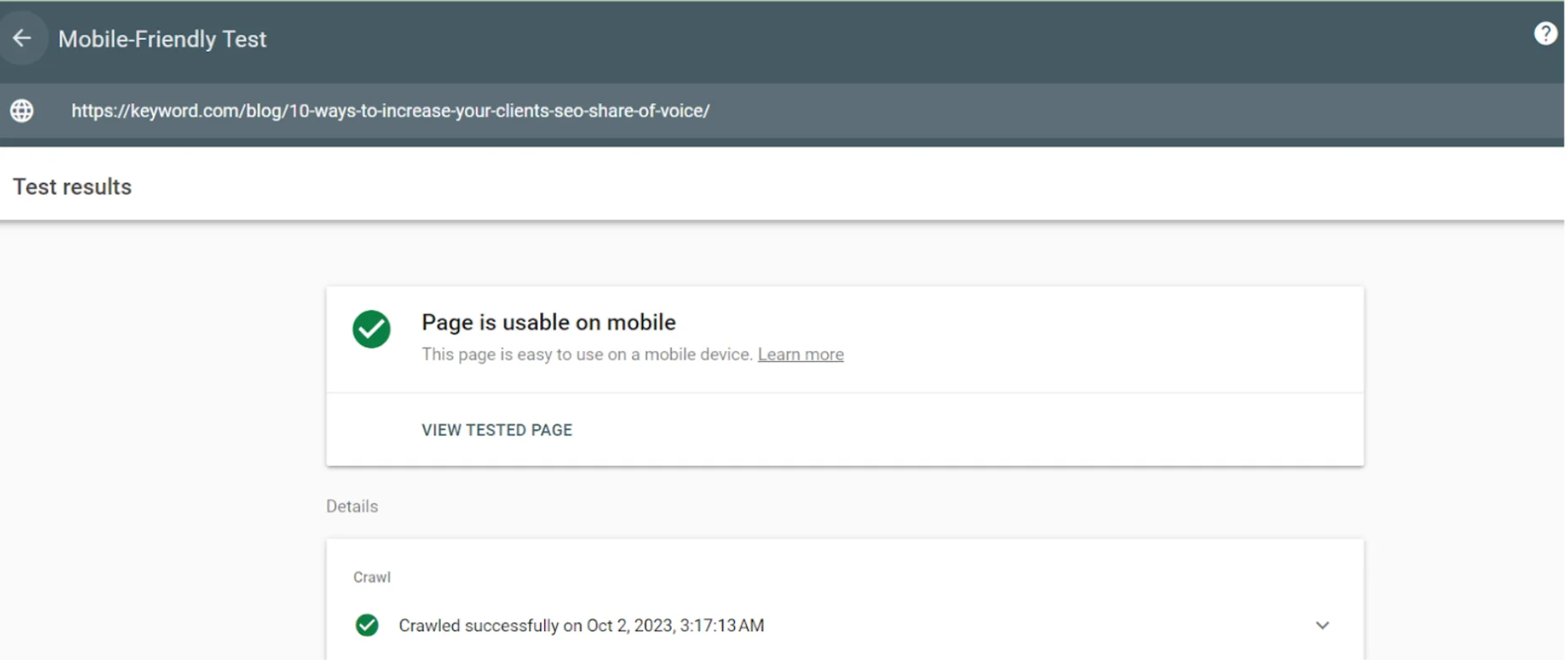
You can use a free tool like Google’s mobile testing tool to check if your web page is mobile-friendly.
Enter the page URL you want to analyze and click “TEST URL.” The process takes a while but displays the result afterward.
5. Prioritize Link-Building
Backlinks are like a gauge for measuring the authenticity of a page. The more links a page has from authoritative and relevant sites, the higher its worth on mobile and desktop search results.
You can build valuable backlinks by:
- Creating link-bait content like original research and trend reports
- Guest posting on relevant sites and earning a backlink in the byline.
- Contributing to subject matter content through platforms like HARO and Qwoted
- Pitch valuable content to replace broken links on external websites
Track Your Keyword Rankings for Both Desktop and Mobile
In the debate over mobile vs. desktop rankings, there should be no clear winner; both should be prioritized and optimized to the best of your ability. However, implementing optimizations is just the first step — it’s also important to track performance to determine your next actions. Keyword tracking allows you to closely monitor your site’s mobile and desktop performance, so you can identify any fluctuations early on.
However, manually monitoring your keyword rankings, especially on multiple device search results, i.e., mobile and desktop, can be time-consuming.
That’s why you need a rank tracker like Keyword.com. Keyword.com provides accurate keyword tracking for organic and local tracking with mobile and desktop options.
Try your 14-day free trial to join over two thousand site owners receiving daily keyword ranking updates and alerts that keep them ahead of ranking fluctuations.